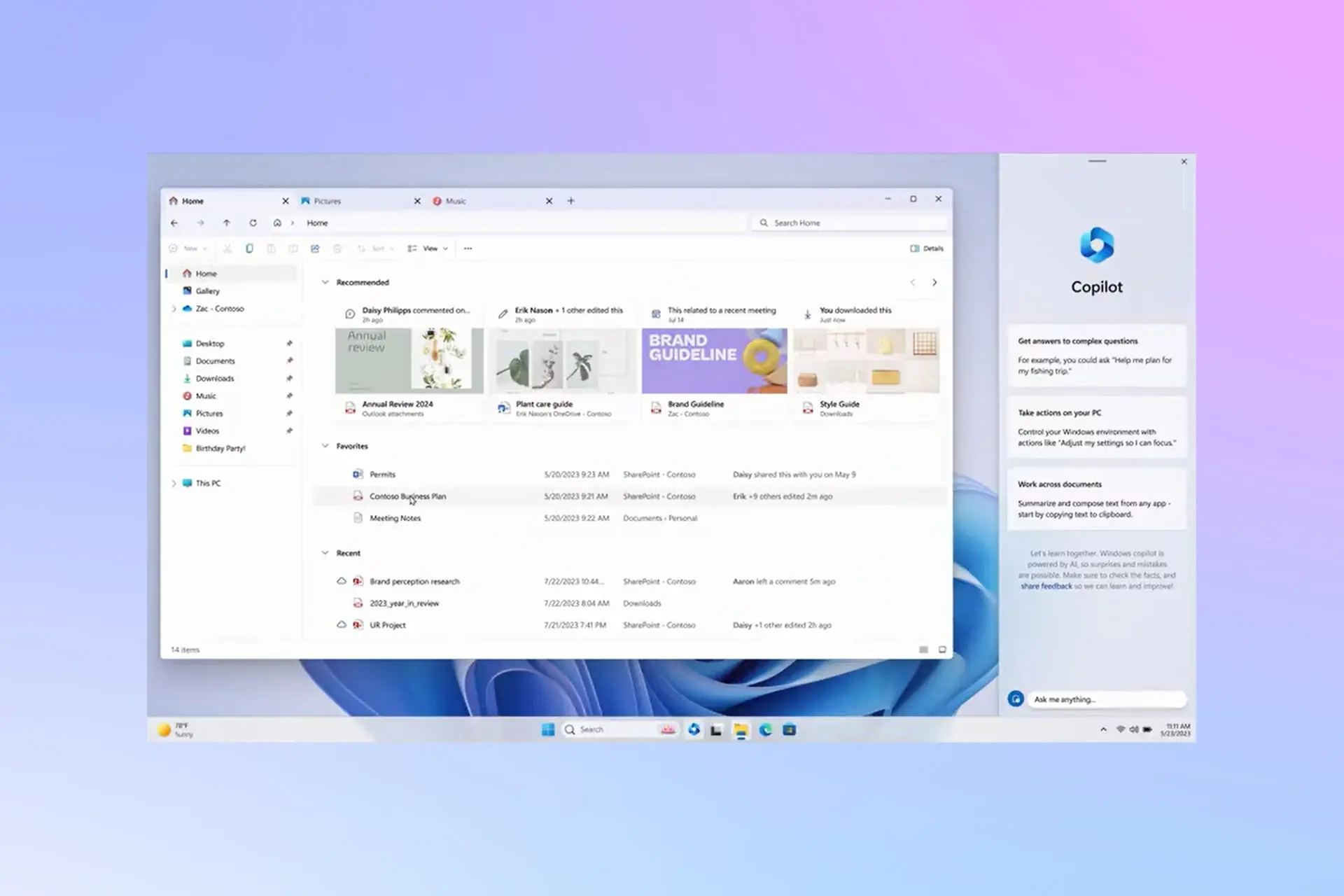
Soon, the design of the Windows 11 file explorer will be more modern.

Other sections of Windows 11 File Explorer will also soon be accompanied by a new design to bring different parts of Windows together more than ever.
Microsoft unveiled the latest design of Windows 11 File Explorer during Build 2023, with new changes aimed at improving the user experience and bringing visual elements of File Explorer in line with Windows 11.
Following a recent report by Windows Central, Microsoft has been working on a major update to Windows 11 File Explorer in recent months to update this section with WinUI 3 elements and enable users to easily use File Explorer with both mouse and touchscreens. The new design also has better integration with Windows 11, using rounded corners and Mica Blur.

Windows 11 File Explorer had its first experience before the Tabs feature was added, with a visual change in the Header. However, other parts of File Explorer still used old elements that did not fit well with the new Windows 11 user interface. Now, the software giant is planning to change that.
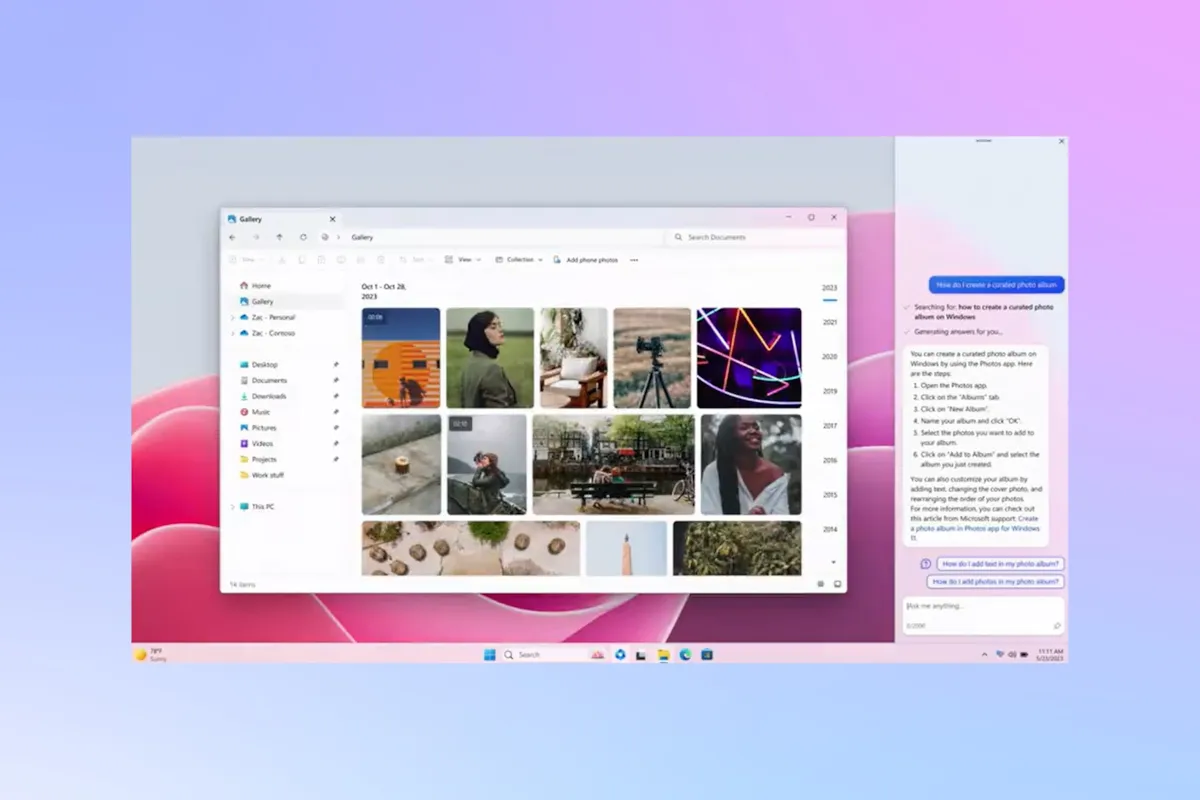
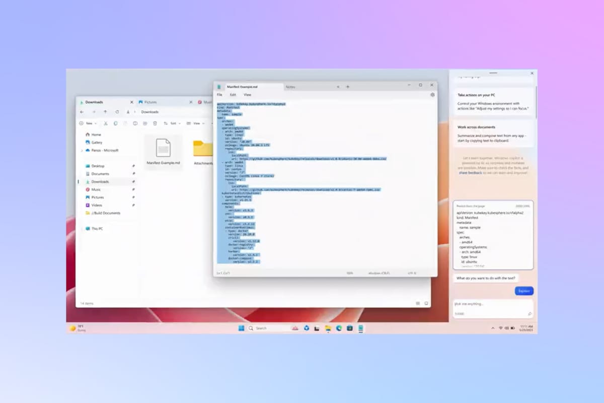
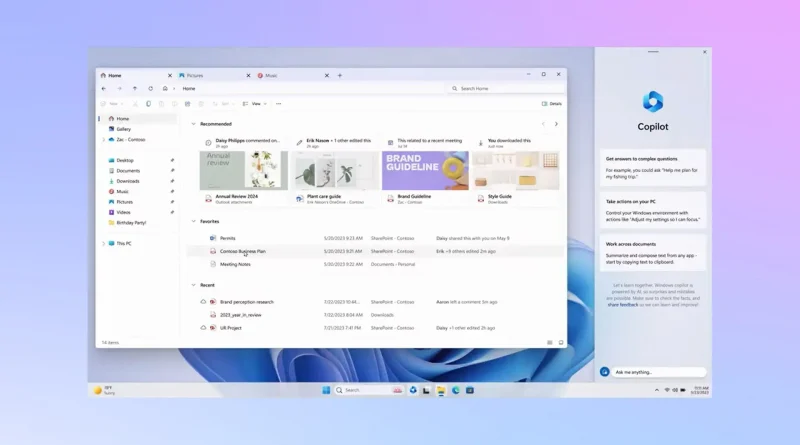
All parts of File Explorer, from the Details panel to folder views, will get a modern look in the new update. As you can see in the images, even the address bar and search box will be included in this change. Additionally, File Explorer control buttons such as New Folder, Copy and Paste will all be moved under the address bar.

The Raymonds are also working on the File Explorer gallery feature, which was recently released in Public Beta. Even the final version of this section will come with a new design.
The updated version of the File Information section in build 23451 is available to Dev Insiders who connect to Microsoft 365, providing a preview of recent activities and shared files along with the origin of files (such as email or chat) available to the user.


